
Create and manage workbook layouts
A workbook contains one or more pages, which you can see at the bottom of the workbook screen. Each workbook page provides a canvas and standard element manipulation tools that make it easier for you to design and compose the visualizations you need, especially when you plan to use a page as a dashboard.
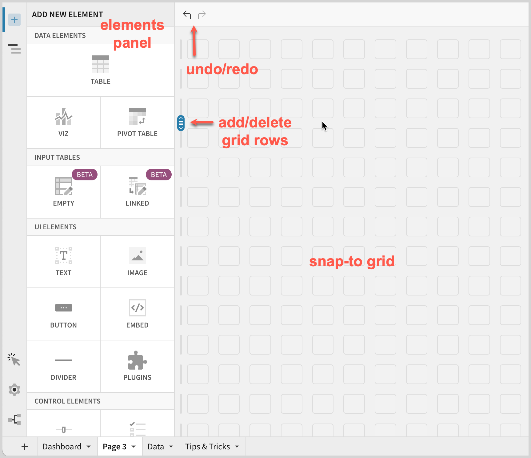
Default canvas for a new page
When you create a new page in a workbook, the page shows the elements panel and a blank canvas. Above the canvas is a menu bar with the undo/redo buttons. The canvas shows a design grid that, by default, enables the snap-to feature. A slider on the left adds or deletes rows in the grid.
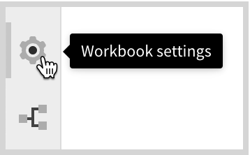
Workbook settings
Use workbook settings to handle configuration for the page as a whole. Access the settings from the Workbook settings button at the bottom left.
For more information see Workbook settings.
Responsive design for desktop and mobile layouts
Workbook pages have two different size modes, desktop layout and mobile layout.
A mobile layout design can be the same as a desktop layout, which is called a synced mobile layout. Alternatively, a mobile layout can have its own design, called a custom, unsynced mobile layout.
By default, the synced mobile layout automatically rearranges the elements to stack on top of each other to better fit the narrow dimensions, based on the ordering in the desktop layout from top left element going to the right and down. You can choose to edit the mobile layout and create a custom mobile layout that is not synced with the desktop layout's order of elements.
Change the size of your browser to see the design in desktop or mobile sizes. The breakpoint for mobile is 600 pixels canvas width (note the browser size is larger than the canvas size when you are designing, due to the elements panel).
View synced vs unsynced mobile layouts
If you resize the browser to the mobile size, a message appears to alert you as to whether the canvas is set to synchronize mobile and desktop layouts.
Synced mobile layout. To edit the mobile layout, please unsync with the desktop layout. Switch to customized.
When you choose Switch to customized, the layouts are no longer in sync.
Unsynced mobile layout. Changes made to the mobile or desktop layout will not affect the other. Sync with desktop.
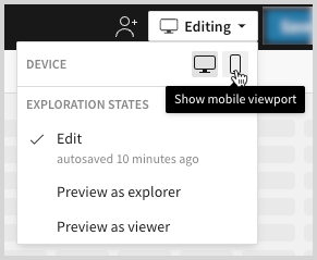
Choose Editing and select Show desktop viewport or Show mobile viewport icons to preview the layout size for each viewport.
Add elements to a page
Drag-and-drop elements from the ADD NEW ELEMENT panel to the canvas. Toggle the panel each time you add a new element. Drag an element to the left or right to place them next to each other.
When you add a new element, a configuration panel opens on the left for the element. Each element has its own type of configuration options. For information about configuring various elements, see the following:
Arrange elements
The canvas gives you helpful tools for arranging elements on your workbook page.
Resize
Move

Multi-select and arrange
You can select multiple elements and move them together. Press Cmd or Ctrl and click each element you want to move, or press Shift and drag to select a set of elements, or select the first and last in a range of elements that you want to select.
Use the Auto row layout and Auto column layout options in the top right to evenly align the elements horizontally or vertically.
Add and remove vertical space between elements
You can add or remove vertical space on the canvas using the resizer handle at the left of the canvas. If the resizer crosses an element in a space that you are resizing, the element also changes size.
If the resizer turns red, an element has reached its minimum height and the canvas cannot resize any further in that direction.

Remove empty vertical space using a button
When there is a vertical gap between elements in the canvas, a Trim Space button appears. Select Trim Space to remove the empty space.
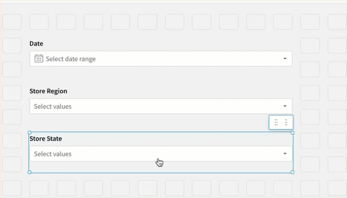
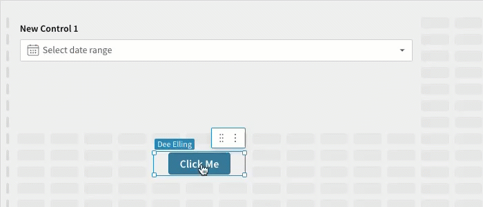
Drag to swap elements
You can drag an element over another to swap the locations and sizes of the elements.
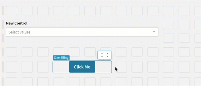
Drag to insert an element
You can insert an element between two other elements. The options for inserting the element change as you drag the element.
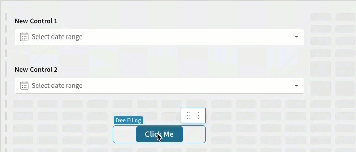
Drag to split vertical space
You can share or split the space used by an element by dragging and dropping another element onto it. The space taken up by the underlying element must be large enough to accommodate both elements.
Elements menu
Each element has a menu with different options depending on the type of element. Select the element and choose  More. For example, the menu for a date range control has the following options:
- Comment: Add a comment to the control.
- Duplicate: Create a copy of the control on the same page, below the original element.
- Copy element: Copies the element to the clipboard, for pasting in another page or below another element.
- Paste element below: Paste the element from Copy element to below the selected element.
- Move to: Move the element to a new or existing page.
- Change control type: Changes the type of control to a related type of control.
- Include nulls: Include nulls when displaying the control.
- Delete element: Removes the element from the page.
Updated 6 days ago